This fictional company was created by Chelsea Rodomista and myself. The company is a scented subscription box targeting females ages 28-32 years old. We did extensive research on our competition and our demographic to appropriately design our packaging and collateral for our company.
We wanted the subscription box to be seasonal to create less of a commitment to consumers. We discovered that if we sold a box that was delivered four times a year, we could charge more and include bigger/better products than if we delivered monthly. We also chose to include products that focused around seasonal scents in the form of candles, body spray, lotions, etc. Once we finalized the product, came up with the name Seasonal EsSCENTials, which played on the idea that these are essential products that you usually only need to replace seasonally. We also played off the word scent because that is the main theme of the products in the box.
Brand Logo
For our logo mark, we wanted something very organic and shows movement in order to play off the idea of the flame of a candle. We used this concept and then turned that idea into a monogram of our company name.


Brand Fonts
We chose a serif font that was humanistic in nature for the logotype. This gave off a youthful yet sophisticated feel to match our demographic. For a secondary font we chose a san serif font to compliment, not compete, with the main brand font.


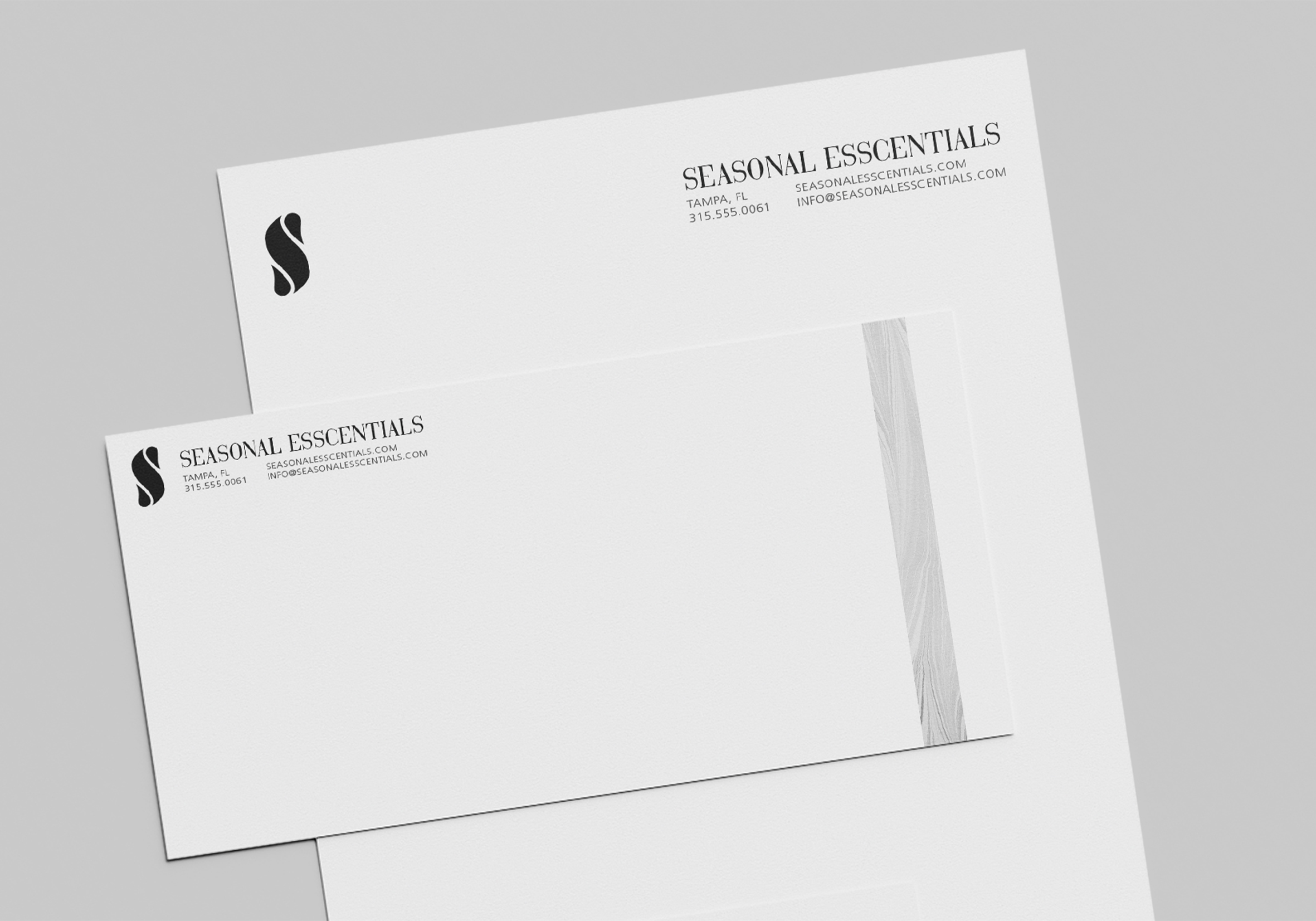
Brand Collateral
The brand collateral needed to unify the company, but not draw attention away from the product. The style is clean, simple, and modern, but still has a fun pattern to stay cohesive with our packaging.
Seasonal Patterns
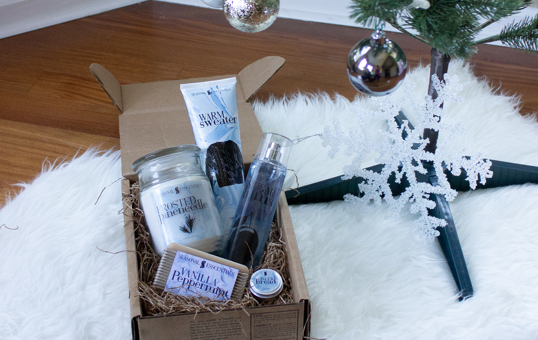
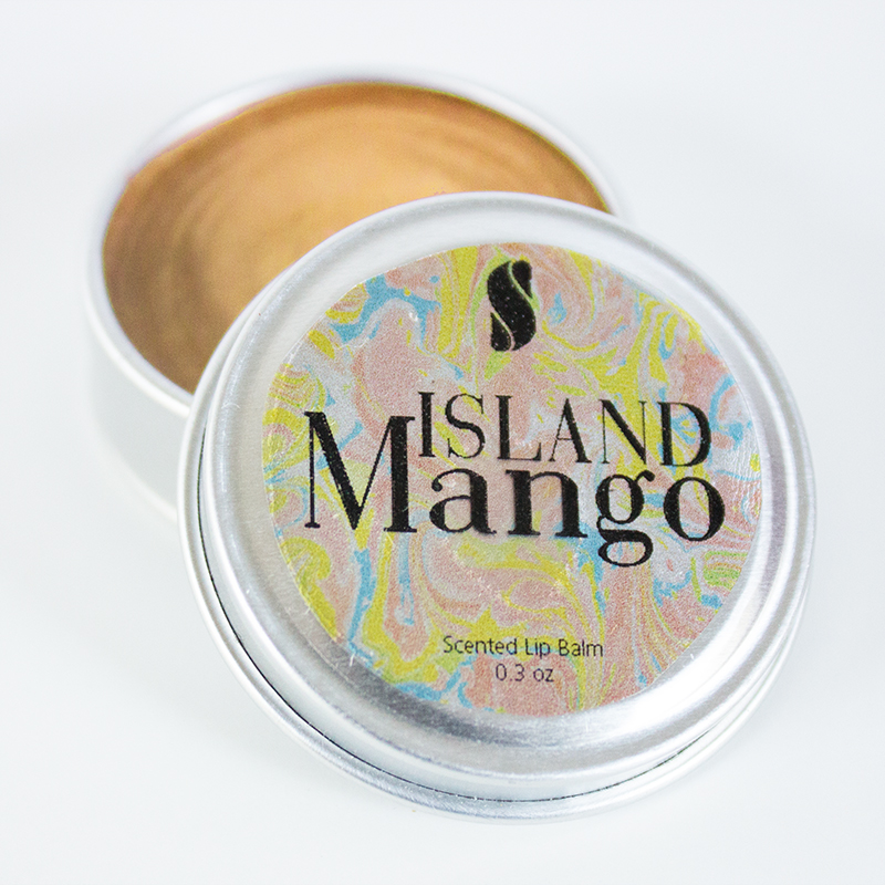
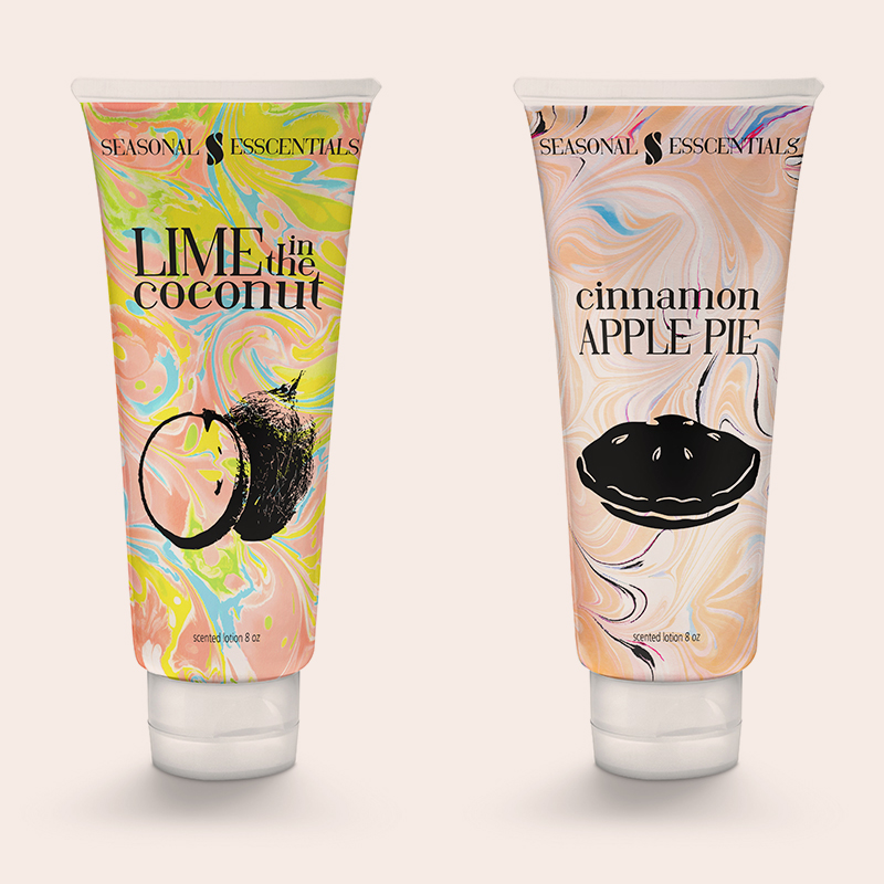
Each seasonal box had a pattern associated with it. All the products in the box that season had the pattern on it to make it a full matching set.

Summer
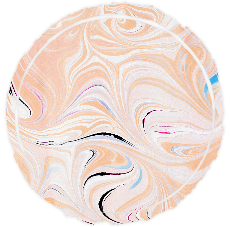
Fall
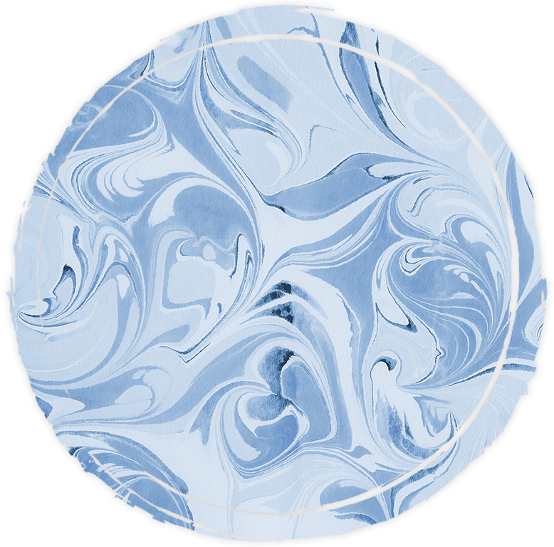
Winter
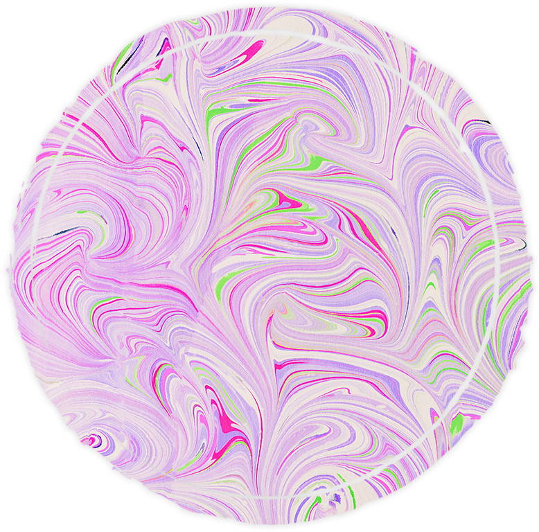
Spring
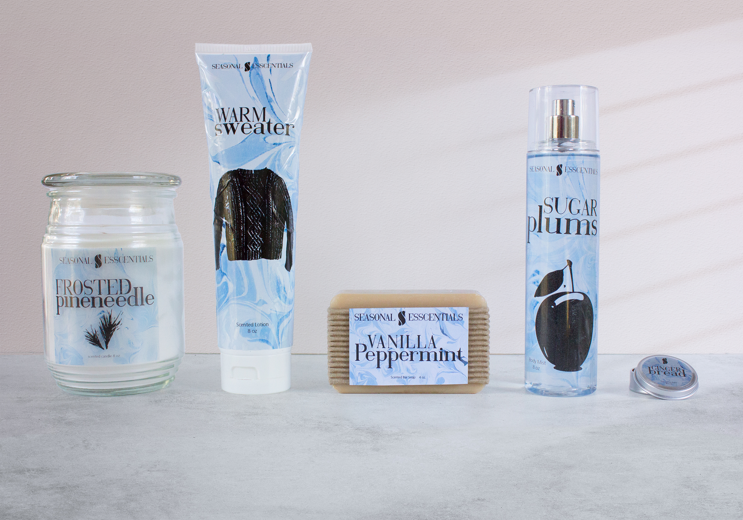
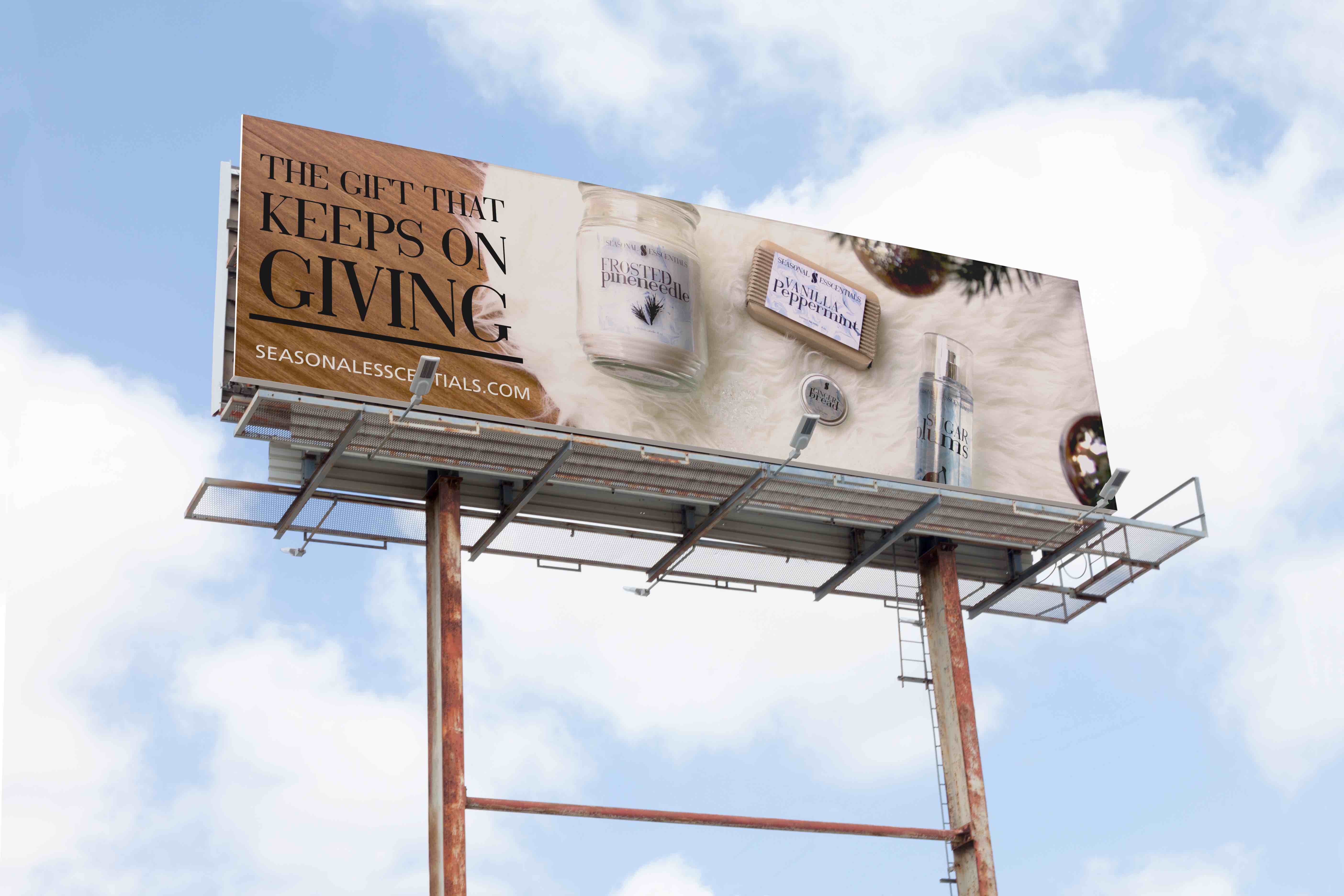
The products in the box consists of an 8 oz candle, an 8 oz body spray, an 8 oz body lotion, a lip gloss, a bar of soap, and a surprise gift related to the season you receive the box. All the labels of the products have a matching marble pattern to look like a set. The colors in the pattern and the scent of the products would play off the season of the box; ex. Ocean Breeze in the summer box. The boxes could be purchased online as well as other full-sized products. This way if a customer liked a certain product, they could order more.

Marketing
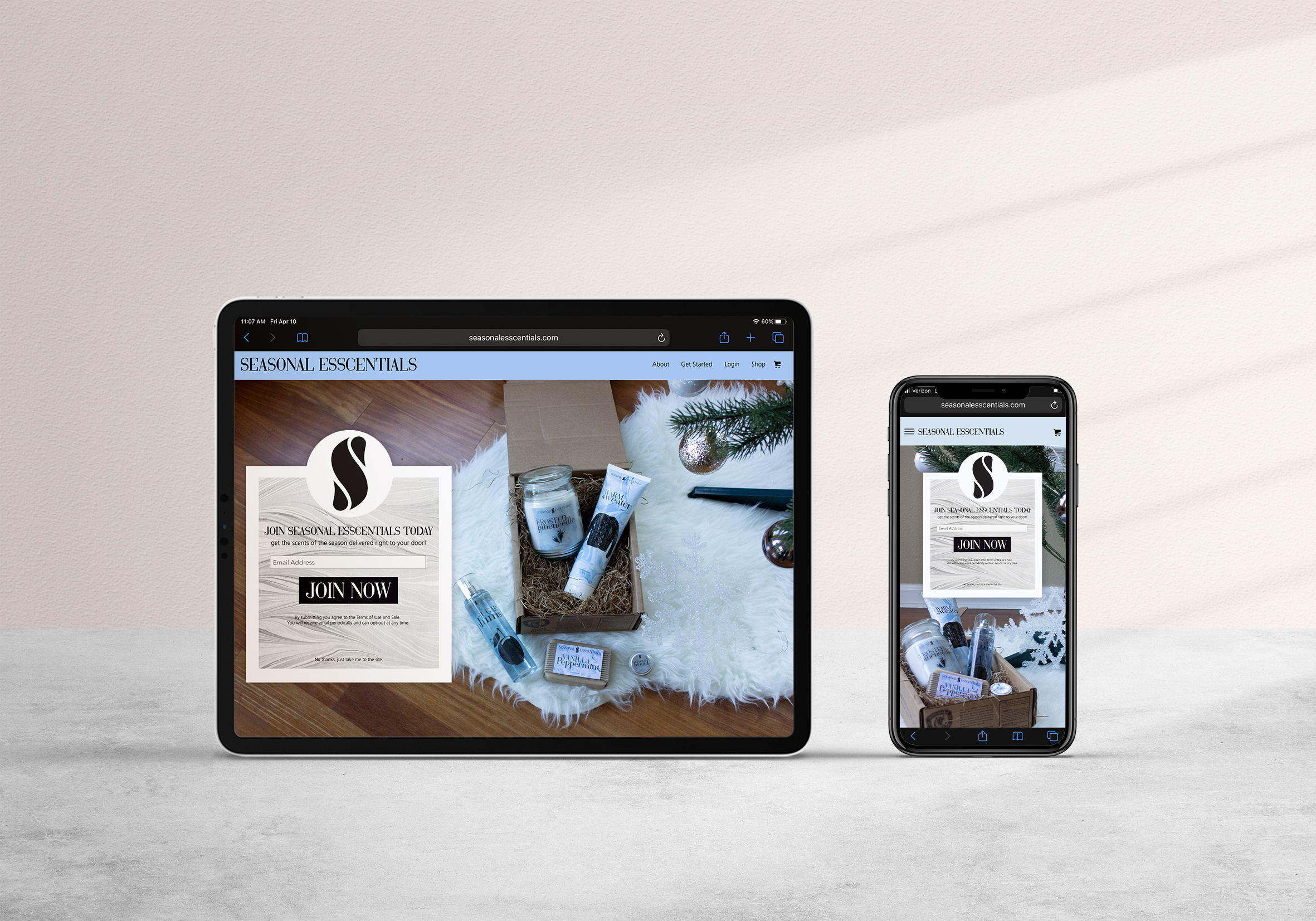
We wanted to rely heavily on social media for our marketing since we are an online shopping experience. This includes posting box on instagram, working with influencers, and paying for sponsored posts. We also wanted to use signage in heavily populated areas like major cities directing consumers to our website for more info.