
“The goal of this campaign is to impact the audience’s feelings. As opposed to telling the audience what they will see and trying to explain what a Believe It or Not! is, this campaign should tell them how they will feel—inciting emotion and connecting with the audience. The “Where” campaign has a feel-good message of inclusivity and uniqueness, a message that parents would be proud to share with their children, in turn taking them to our Ripley attractions.”
Campaign Primary Colors
These primary colors are currently used within the Ripley cartoons shared on social media, in an effort to help tie the social experience to the 2020 campaign. The palette pulls in the Ripley brand colors with reds and golds, and then brings in other cooler tones found within our attractions. These colors also help give the campaign a modern-vintage vibe, allowing bold typography and imagery to contrast.


Campaign FONTS


Marketing
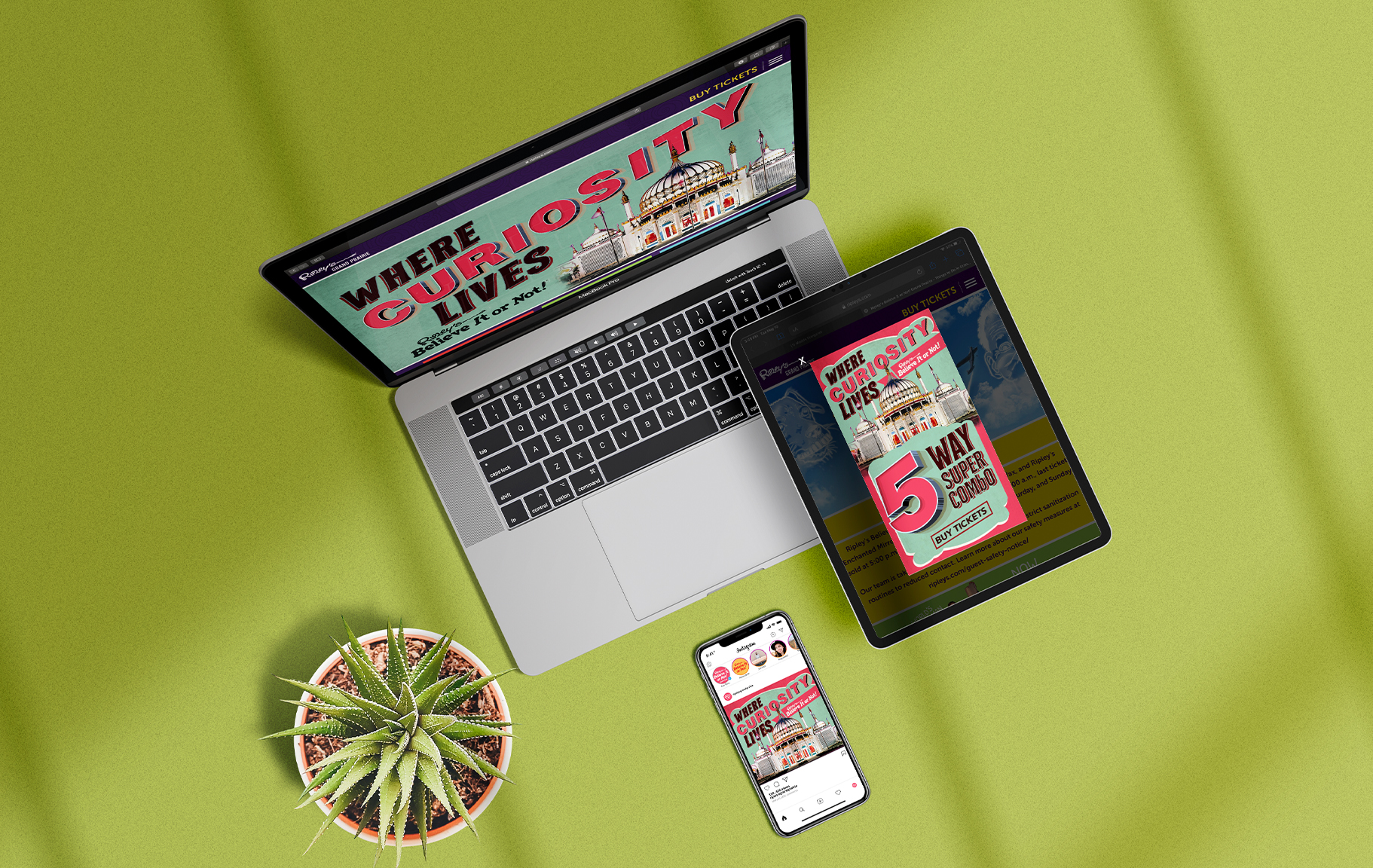
This campaign is built to be versatile for both print and digital platforms. In some instances, the digital asset is very small, which is where the typography becomes the hero image over the actual imagery. While this CTA can act alone and be implied, in certain uses an additional CTA will be needed to further the message. Below is a sample slider using a simple CTA of “Visit Now”.
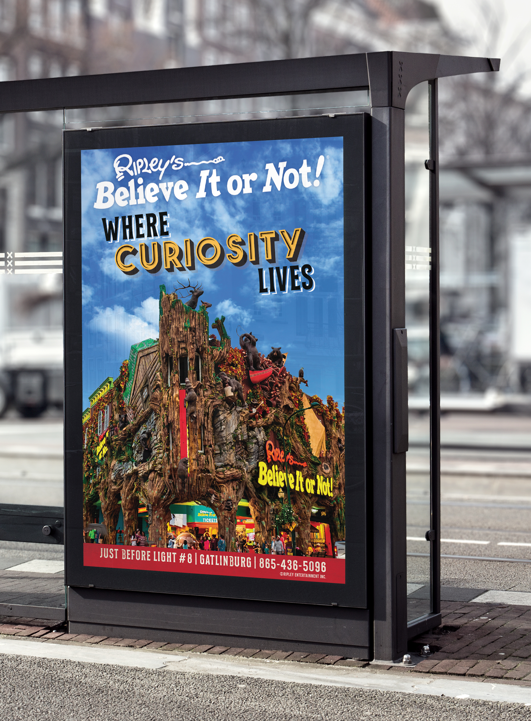
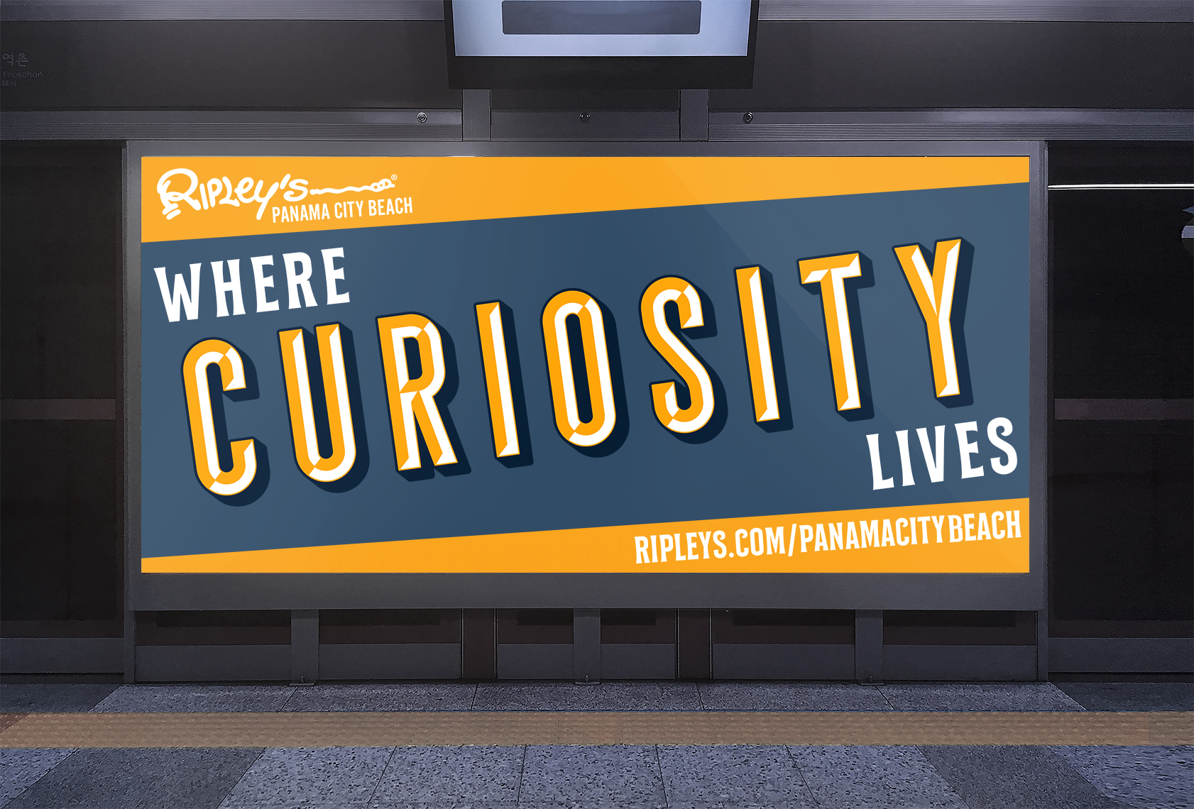
This campaign style works for both digital and print billboard formats as well. It is important to choose the right color and imagery for the location, as well as the environment surrounding the billboard.
expanding the campaign
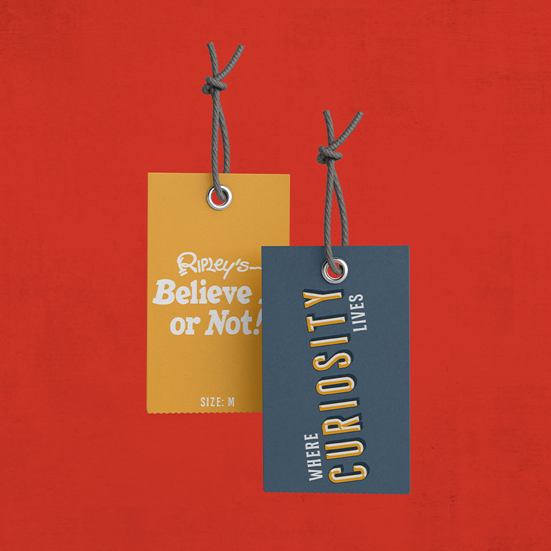
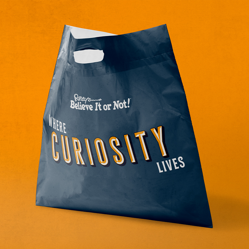
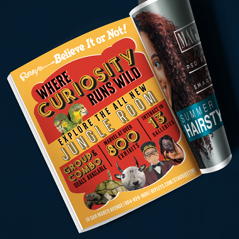
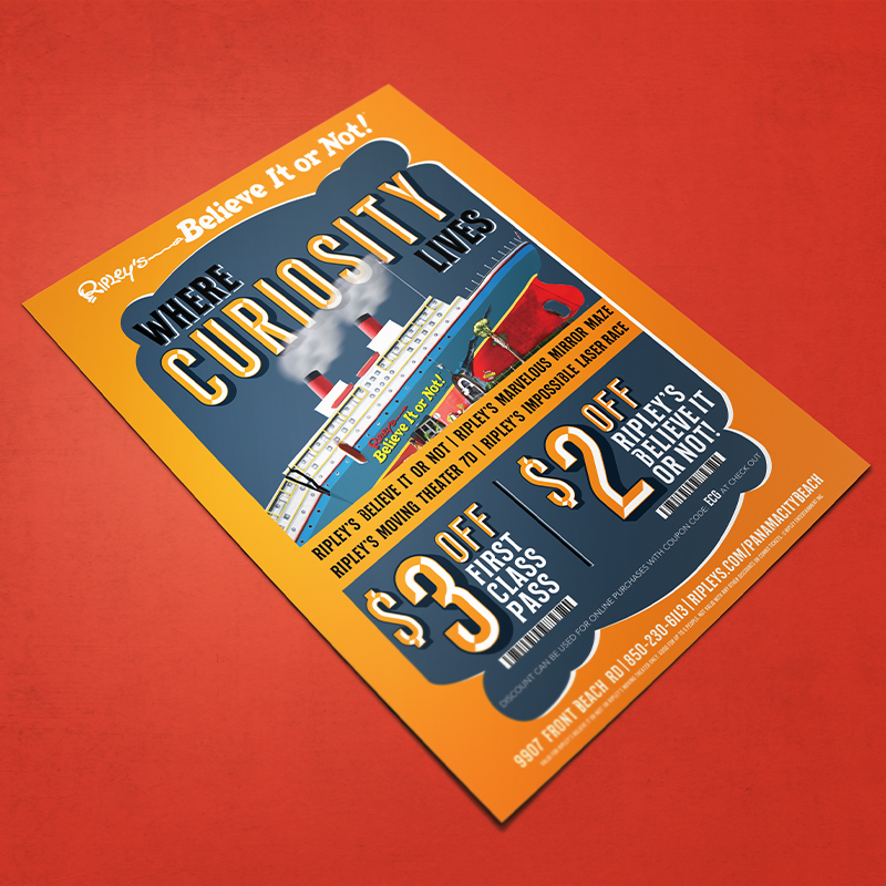
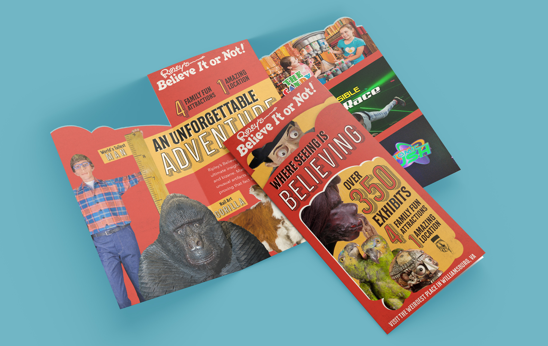
The campaign was proven successful in our markets, so we wanted to expand the campaign into an overall brand image. Below are a few concepts of how we could expand the style for our branding and bring it into our retail markets.