Prism by Logitech was a fictional sub-brand of Logitech created by Michael Chetelat and myself. The goal was to create a sub-brand and redesign packaging for an electronic in an effort to make it more sustainable and reduce waste. We created a custom dieline used chipboard to reduce the amount of material used and to make the package 100% recyclable.

BRAND LOGO
The logomark plays on the geometric aspects of classic video game consoles, while relating back to the name of the sub-brand. We chose a geometric san serif font for our logotype that played upon the gamer style of our mark. We wanted it to give off a techy vibe, while still being readable and simplistic. This also connected the style of our sub-brand to the style of current Logitech product lines.
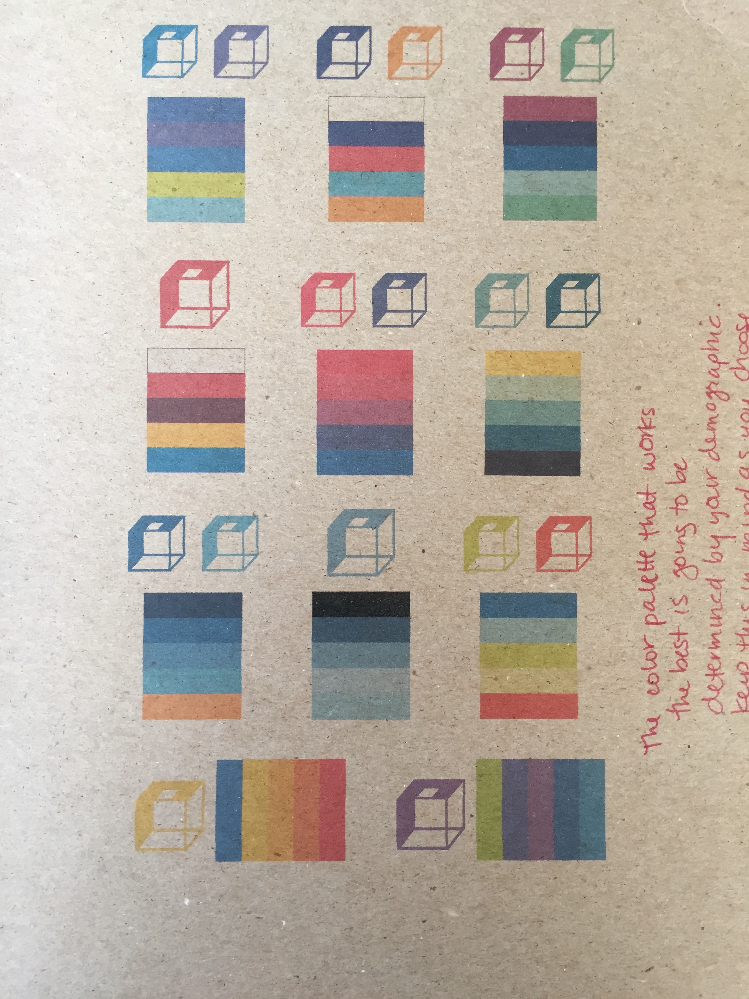
COLOR STUDY
Chipboard is a difficult material to work with when deciding color schemes. Sometimes one color scheme looks good on the computer, but totally different on the board. We tested a bunch of different combinations before decided on the best one based on our demographic and ability to stand out on the shelves.
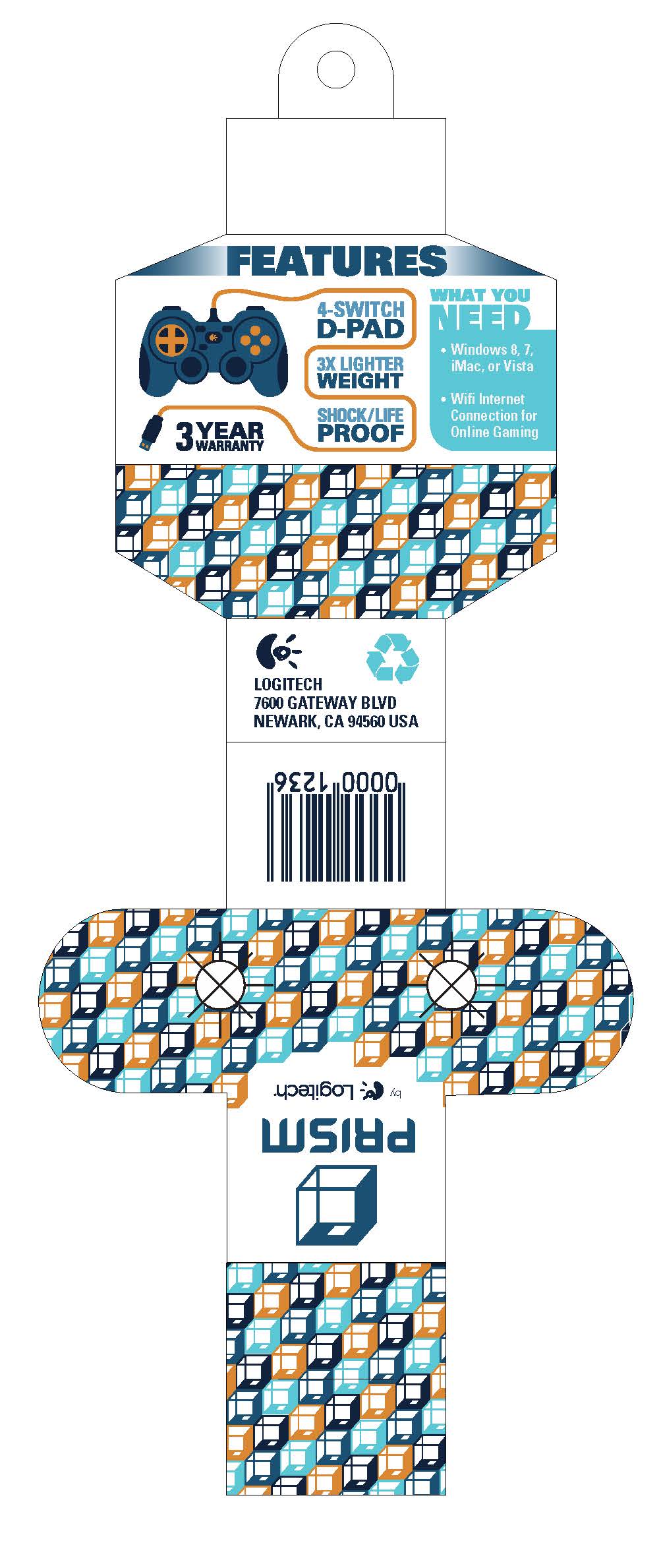
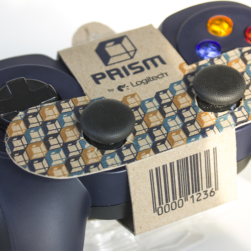
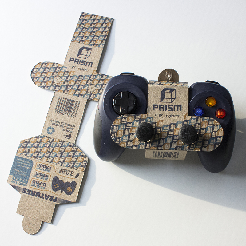
Custom Packaging
We tested several different dielines for our packaging, we wanted to minimize material and showcase the actual product. Since a controller has an awkward shape, it took a lot of trial and error before coming up with the perfect custom dieline. The final packaging would wrap around the controller hugging the joysticks and hang on display racks in stores. The front needed to be simple, just the logo and product number. We had the barcode on the bottom fold to increase room on the back for product features. The information on the back was organized using visual hierarchy as well as an image of a cord of a controller. To add visual flare to the packaging we turned the logo into a pattern, which helped to fill the empty space and create brand awareness. Overall our new packaging reduced waste by 80% compared to the controller’s original packaging.